Mock-up of the Award–winning Philharmonic Hall in Szczecin 3D Printed on Zortrax M200
Each masterplan needs the basis to develop and to work on to obtain is final shape. That’s why the team of designers Barozzi/Veiga decided to follow the advice of one of the Zortrax official resellers in Spain – Tresdenou and use Zortrax M200 to create their architectural mockup. As the Zortrax team, we are obviously proud that thanks to delivering such good and reliable solutions, like Zortrax M200 3D printer, the dedicated Z-Suite software and the printing materials, we could contribute to the success of the designers in creating such a splendid hall.
Device that Makes the Difference

Using a 3D printer to visualize the architectural projects has grown in popularity and nowadays most of the designers can’t imagine their work without incorporating such a device. It is mainly because the way from designing the model and materializing it is quite long and effort-consuming. Typical mockups consist of many fine elements, so it is really hard to create them by performing everything manually. Providing the designers with the solution where they can turn their digital projects into real, tangible objects within just a few clicks obviously makes life easier. Not to mention the user-frendliness and intuitiveness of the Zortrax M200 3D printer, as the designers stress that “Its ease of use has allowed us to become familiar with it relatively quickly and thanks to its high accuracy we could obtain very good finishes.”
When Parameters Matter
Another aspect to focus on is the precision of the details in the mockup, as Barozzi/Veiga admit that “ The accuracy and fidelity of the model allows (us) to analyze more precisely the project.” Bearing this in mind it doesn’t surprise that the designers decided to rely on Zortrax M200 and its precision and dimensional accuracy. Quality results of small models are guaranteed thanks to the 3D printer resolution which is 90-400 microns an the minimal 0.9 mm layer thickness together with other useful functionalities like Smart Bridges or Auto Arranging.
Tradition with a Modern Feel
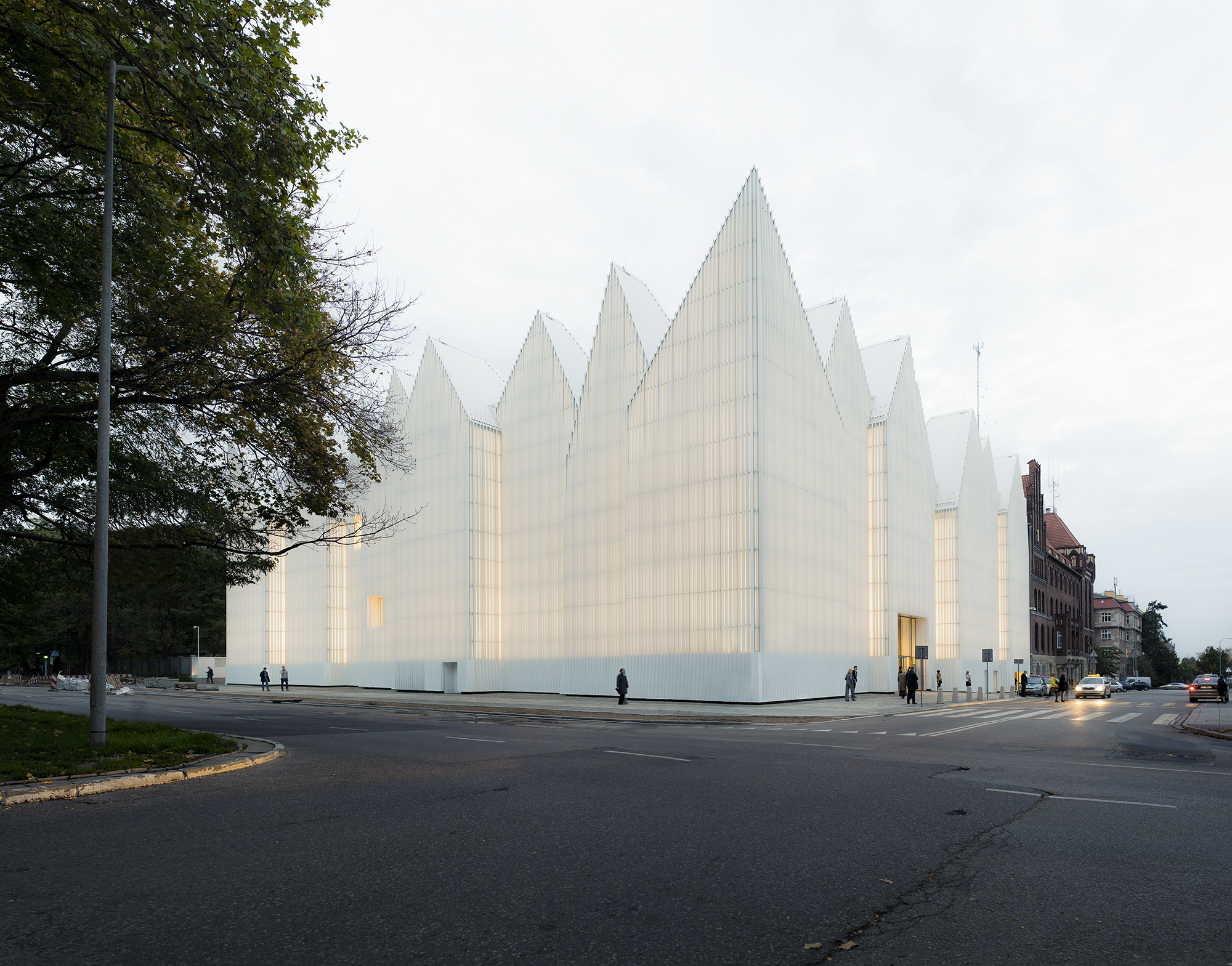
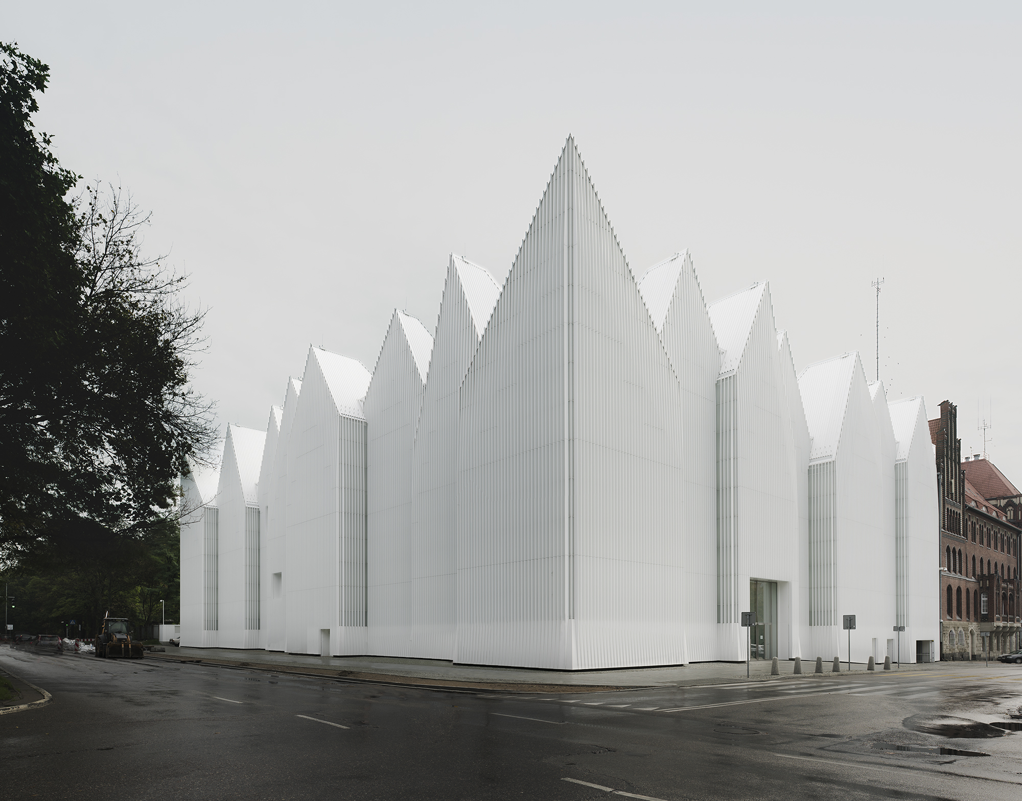
The building itself is huge, yet very smartly-designed and functional. The white block with edgy roof combines both traditional and modern, urbanistic ideas that together bring the interesting outcome. From the distance the building draws the idea of simplicity and kind of popular, minimalistic approach, very present in today’s architecture and design. Yet, after making a closer look to its surface, we can get an insight to its complexity, as the façade is rich in multiple folds made of glass. What is more, the glass structure allows to change the color of the building by choosing a particular color of lighting. Because of this the concert hall, sometimes appears vivid red, blue or green, which creates a unique visual sensations.
Lurk into the Symphony Hall
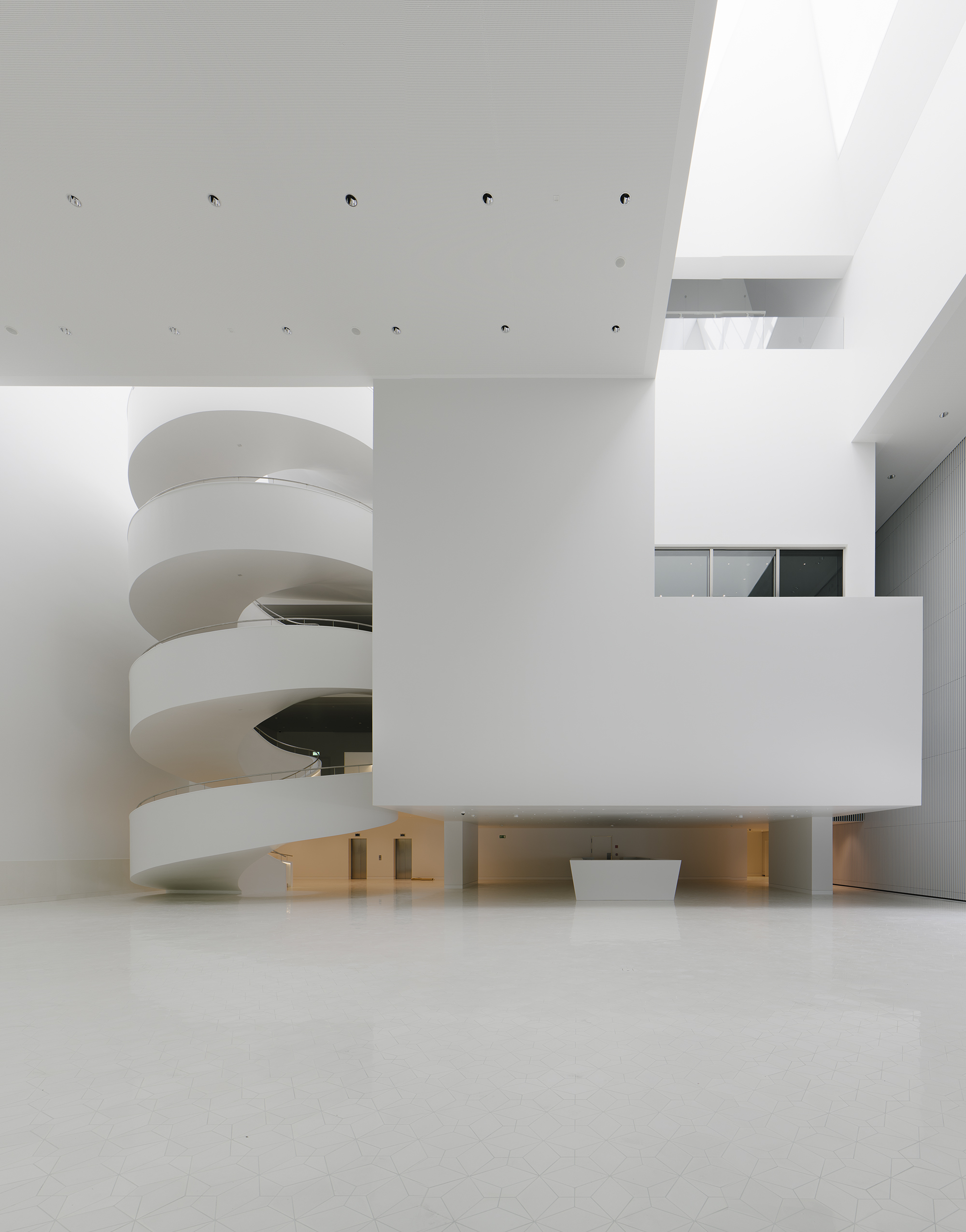
The interior of the philharmonics is even more interesting and surprising. Most of the spaces inside the building are simple and covered with plain white color, the only accent that breaks the unified design is bold-colored furniture placed in some of the rooms. However, in contrast with the rest of the rooms, the designers decide to make the heart of the whole philharmonics – the symphony hall, totally different.
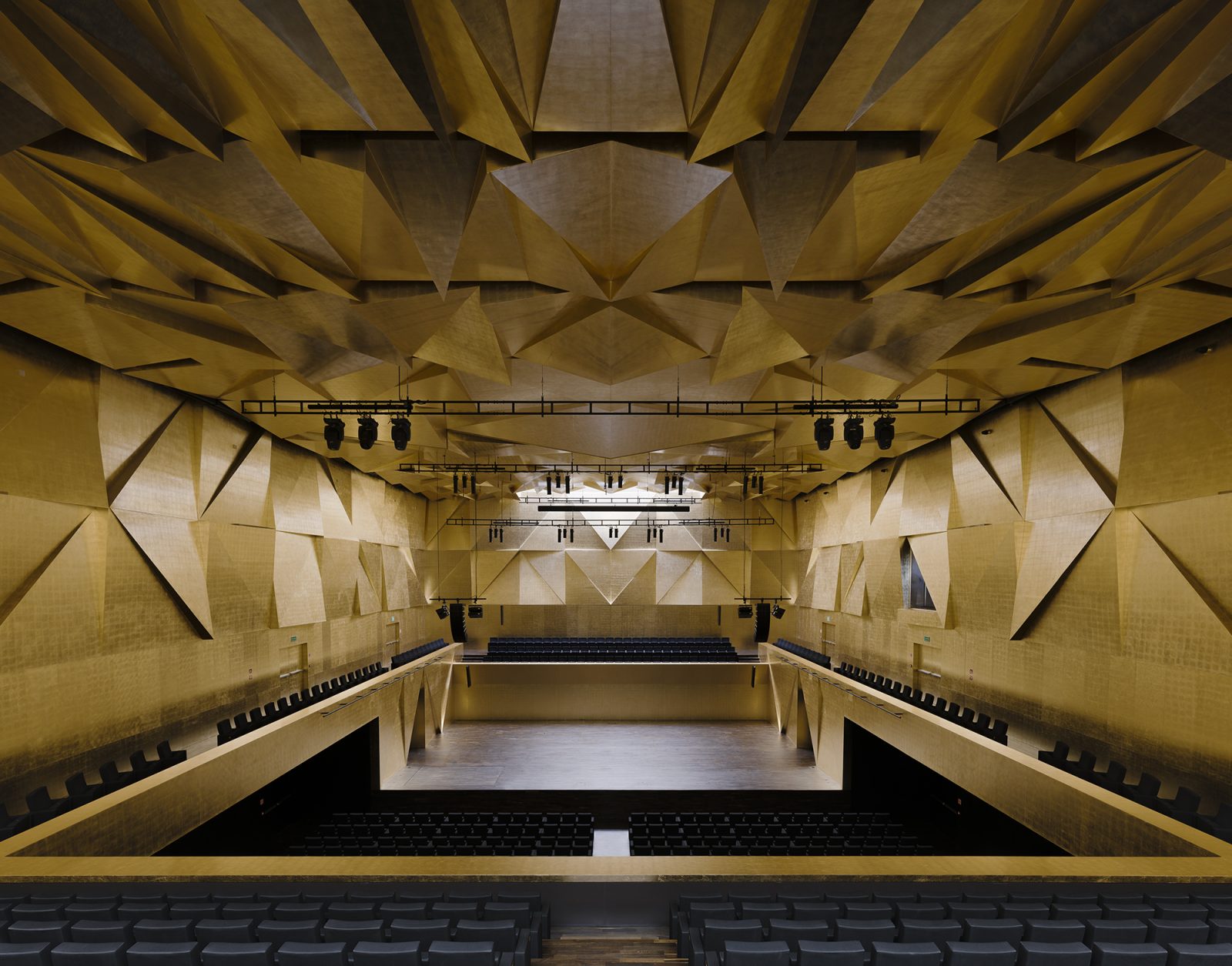
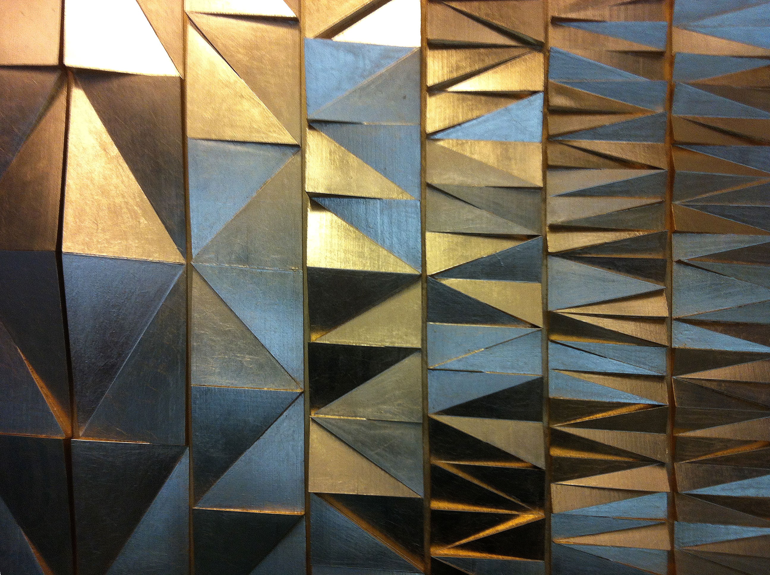
The space is unique manly due to its wall texture, the surface of walls was created of geometrically-shaped modules plated with gold that produce amazing effect and guarantee proper acoustics. The side panels that are installed on the walls in the symphonic hall were previously 3D printed on Zortrax M200 and thanks to the device precision, served as a mockups for display.
Wide Recognition
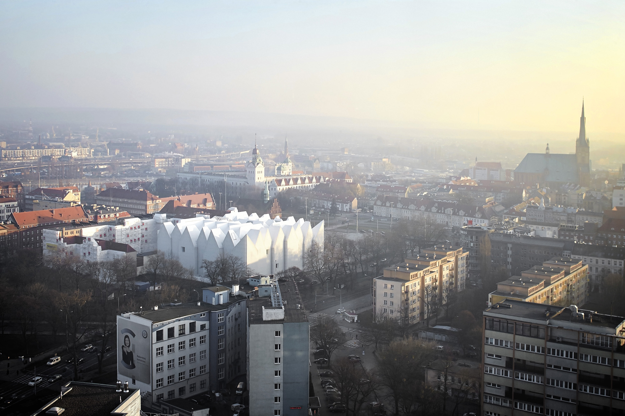
The perfect combo of functionality and undoubtedly aesthetic values helped the hall gain much recognition among the jury of Mies Van de Rohe award 2015, which is a biannual prize given to the best constructions in Europe. Chosen from more than 420 projects from 36 countries, the project of Barozzi/Veiga studio received the interest thanks to the big architectural challenge they had to face. The former building of the philharmonics was destroyed during the II World War, so the approach was that the new one should reflect some of the rich symbolic of the Polish past and express the elements that are characteristic of the town specific. The designers seemed to manage and came up with the building that apart from its ultra modern looks, reflects the shape of neogothic edges that characterize the architecture of the town’s dwellings. What is more, the hall gives the impression of a huge crown which links back to the era of Polish kings and it’s now an original and distinctive part of the cityscape.
Photo credits: Simon Menges, Hufton+Crow.